library(tidyverse)

# Read directly from public URLs
person_df <- read_csv("https://raw.githubusercontent.com/yesols/aou-workshop/refs/heads/main/data/demographic_data.csv")
condition_df <- read_csv("https://raw.githubusercontent.com/yesols/aou-workshop/refs/heads/main/data/conditions.csv")
drug_df <- read_csv("https://raw.githubusercontent.com/yesols/aou-workshop/refs/heads/main/data/drug_exposures.csv")More Data Wrangling and Exploratory Data Analysis
1 Learning Objectives
In this session, we will continue data wrangling with larger datasets that resemble All of Us EHR data. We will also learn common functions to explore data and visualize data.
At the end of Session 3, you will be able to:
- Clean up and merge dataframes to create an analysis-ready dataset.
- Use R commands to understand data.
- Perform descriptive statistics.
- Visualize data with box plots, histograms, and scatter plots.
2 Reading Files
In programming, plain-text files are preferred over application-dependent file formats such as Word or Excel files. Comma-separated values (CSV) format is a popular file format for tabular data. We use this file type extensively to work with All of Us data.
We use read_csv() function to read CSV files into dataframes so we can work with them. Typically, we put the file path inside the function, which will look like read_csv("file.csv") or read_csv("directory/file.csv"). For this practice, I placed practice files on the web so that they can be directly read via file URLs. Copy/paste and run the following code to obtain the data:
Note
The data in these files are randomly generated and completely fake, but designed to resemble All of Us data although much simplified.
Now, try the commands, dim(), head(), tail(), str(), etc, to inspect the these three dataframes.
In subsequent sections, we will learn how to clean up data and merge these three dataframes. Ultimately, we will analyze the dataset to investigate association between anticholinergic medications (exposure) and dementia (disease).
3 Recoding Values
Sometimes we have to recode values in categorical variables. For example, race in All of Us often have categories you might want to collapse into one. Let’s take a look at our example data.
# Inspect the first few lines of the demographics data
head(person_df)
# A tibble: 6 × 4
person_id year_of_birth race sex_at_birth
<dbl> <dbl> <chr> <chr>
1 1 1987 Skip Male
2 2 1987 Asian Female
3 3 2004 Asian Male
4 4 1944 Black or African American Male
5 5 1941 Asian Male
6 6 2006 More than one population Male person_df %>% count(race) # Count the values in race column# A tibble: 7 × 2
race n
<chr> <int>
1 Asian 20
2 Black or African American 23
3 More than one population 6
4 None of these 5
5 Other 4
6 Skip 4
7 White 38“More than one population” and “None of these” can be recoded as “Other”. We could also change “Skip” to “Unknown” and “Black or African American” to “Black” for simplicity. We can use recode_values() if we are changing all values or replace_values() if just updating some of the values. In our case, we just want to tweak some of the categories, so we’ll use replace_values().
# Recode race category
person_df <- person_df %>%
  mutate(
    race = replace_values(
      race,
      "Black or African American" ~ "Black",
      "Skip" ~ "Unknown",
      c("More than one population", "None of these") ~ "Other"
    )
  )
Check the counts again to make sure it worked. This is a good practice to also ensure NAs were not introduced as a result of a coding mistake.
person_df %>% count(race)# A tibble: 5 × 2
race n
<chr> <int>
1 Asian 20
2 Black 23
3 Other 15
4 Unknown 4
5 White 38Similarly, we’ll also clean up sex_at_birth categories. We will change anything other than “Female” or “Male” to “Other”.
# Recode sex_at_birth
person_df <- person_df %>%
  mutate(
    sex_at_birth = replace_values(
      sex_at_birth,
      c("Intersex", "Prefer not to answer", "Skip") ~ "Other"
    )
  )
Check the result:
person_df %>% count(sex_at_birth)# A tibble: 3 × 2
sex_at_birth n
<chr> <int>
1 Female 44
2 Male 48
3 Other 84 Selecting Earliest Occurrence
When you extract conditions, drug exposures, or lab measurements data in All of Us, there are multiple entries per person. In our practice data, we will pick the earliest occurrence of the condition and the earliest occurrence of drug exposure. slice() and its variations, slice_head(), slice_sample(), “slice_min(), "slice_max() are useful for subsetting a dataframe in a variety of ways. We will use slice_min() to pick the earliest date for each person. group_by() function allows us to perform slice_min() on grouped rows by person_id rather than globally.
earliest_condition <- condition_df %>%
  group_by(person_id) %>%               # group rows by person_id
  slice_min(
    order_by = condition_start_date,    # specify which column to evaluate
    n = 1,                              # pick one row
    with_ties = FALSE                   # keep only one in case of ties
  ) %>%
  ungroup()
We do the same for drug dataframe:
earliest_drug <- drug_df %>%
  group_by(person_id) %>%
  slice_min(
    order_by = drug_exposure_start_date,
    n = 1,
    with_ties = FALSE
  ) %>%
  ungroup()
5 Merging Demographics with Clinical Data
When you extract All of Us data with auto-generated queries, you will have separate dataframes for “person”, “conditions”, “drug exposures”, etc, and you must combine them for analysis. We will use left_join() that we learned earlier to merge condition_df and drug_df to person_df.
combined_df <- person_df %>%
  left_join(earliest_condition, by = "person_id") %>%
  left_join(earliest_drug, by = "person_id")
head(combined_df)  # Check result
# A tibble: 6 × 9
person_id year_of_birth race sex_at_birth condition_concept_id
<dbl> <dbl> <chr> <chr> <dbl>
1 1 1987 Unknown Male NA
2 2 1987 Asian Female NA
3 3 2004 Asian Male NA
4 4 1944 Black Male NA
5 5 1941 Asian Male NA
6 6 2006 Other Male NA
# ℹ 4 more variables: condition_start_date <date>,
# condition_source_value <chr>, drug_concept_id <dbl>,
# drug_exposure_start_date <date>6 Establishing Temporal Sequence with Dates
In epidemiological research, establishing a timeline is critical. A drug cannot be considered a risk factor for a disease if it was prescribed after the disease was diagnosed. Because we merged our datasets in the previous session, our combined_df now contains both drug_exposure_start_date and condition_start_date. Because R recognizes these columns as Date data types, we can compare them mathematically to determine the “true” exposure status of our patients.
We will use case_when() function which allows us to write multiple logical conditions, evaluating each row step-by-step to assign the correct exposure status.
combined_df <- combined_df %>%
  mutate(
    true_exposure_status = case_when(
      # Condition 1: No record of taking the drug
      is.na(drug_exposure_start_date) ~ "Unexposed",
      # Condition 2: Took the drug, but never got the condition
      !is.na(drug_exposure_start_date) & is.na(condition_start_date) ~ "Exposed",
      # Condition 3: Took the drug BEFORE the condition started
      drug_exposure_start_date < condition_start_date ~ "Exposed",
      # Condition 4: Took the drug AFTER the condition started
      drug_exposure_start_date >= condition_start_date ~ "Unexposed (Post-Diagnosis)"
    )
  )
Let’s check our work by looking at the patients who had both the drug and the condition:
combined_df %>%
  filter(!is.na(drug_exposure_start_date) & !is.na(condition_start_date)) %>%
  select(person_id, drug_exposure_start_date, condition_start_date, true_exposure_status) %>%
  head()
# A tibble: 6 × 4
person_id drug_exposure_start_date condition_start_date true_exposure_status
<dbl> <date> <date> <chr>
1 10 2002-04-28 2012-02-17 Exposed
2 13 1992-01-21 2001-09-25 Exposed
3 14 2048-05-09 2056-07-03 Exposed
4 25 2048-11-22 2056-10-02 Exposed
5 27 2044-02-09 2048-10-30 Exposed
6 34 2025-12-05 2027-02-04 Exposed
NoteMath with Dates
Because dates are stored as numbers under the hood, you can also subtract them! For example, condition_start_date - drug_exposure_start_date will output the exact number of days between the two events.
7 Writing and Saving Files
Suppose we are ready to wrap up for the day and save our work. In order to save our data, we use write_csv() function to save the dataframe as a CSV file. Its arguments are the dataframe name and a file path:
write_csv(combined_df, "cleaned_dataset.csv") # file path will be different8 Reading files 2
To resume working on the data, let’s read back in the file. This file is what we saved after merging dataframes earlier, but I added an additional column SBP for systolic blood pressure.
library(tidyverse)
df <- read_csv("https://raw.githubusercontent.com/yesols/aou-workshop/refs/heads/main/data/final_dataset.csv")
head(df)
# A tibble: 6 × 11
person_id year_of_birth race sex_at_birth condition_concept_id
<dbl> <dbl> <chr> <chr> <dbl>
1 1 1987 Unknown Male NA
2 2 1987 Asian Female NA
3 3 2004 Asian Male NA
4 4 1944 Black Male NA
5 5 1941 Asian Male NA
6 6 2006 Other Male NA
# ℹ 6 more variables: condition_start_date <date>,
# condition_source_value <chr>, drug_concept_id <dbl>,
# drug_exposure_start_date <date>, true_exposure_status <chr>, SBP <dbl>9 Create Necessary Variables for Analysis
We will create an age column from year_of_birth.
df <- df %>% mutate(
  age = 2026 - year_of_birth
)
head(df)
# A tibble: 6 × 12
person_id year_of_birth race sex_at_birth condition_concept_id
<dbl> <dbl> <chr> <chr> <dbl>
1 1 1987 Unknown Male NA
2 2 1987 Asian Female NA
3 3 2004 Asian Male NA
4 4 1944 Black Male NA
5 5 1941 Asian Male NA
6 6 2006 Other Male NA
# ℹ 7 more variables: condition_start_date <date>,
# condition_source_value <chr>, drug_concept_id <dbl>,
# drug_exposure_start_date <date>, true_exposure_status <chr>, SBP <dbl>,
# age <dbl>It is also useful to have binary variables to indicate their disease status and drug exposure status. We will use if_else() function for this purpose. if_else() takes three arguments: condition to evaluate, value if the evaluation is true, value if false.
df <- df %>%
  mutate(
    condition_status = if_else(is.na(condition_concept_id), 0, 1), # 0 if condition_concept_id is NA, 1 if not
    exposure_status = if_else(true_exposure_status == "Exposed", 1, 0) # 1 if true_exposure_status is "Exposed", 0 if not
  )
NoteBinary Coding with 1s and 0s
While you can certainly code your binary variables with character, such as “yes” and “no” or “exposed” and “unexposed,” it is safer to code them numerically especially if you are performing logistic regression.
10 Contingency Table
Let’s take a quick look at MCI/dementia cases breakdown by sex.
df %>% count(sex_at_birth, condition_status)# A tibble: 6 × 3
sex_at_birth condition_status n
<chr> <dbl> <int>
1 Female 0 28
2 Female 1 16
3 Male 0 37
4 Male 1 11
5 Other 0 5
6 Other 1 3You might prefer a simpler cross tabulation using a base R function, table():
table(df$sex_at_birth, df$condition_status)
          0  1
  Female 28 16
  Male   37 11
  Other   5  3
11 Summarize Data
summary() function can give you a quick overview of data and its distribution. It also will show you a count of NAs in each column. You can use summary() on a vector (or a single column from a dataframe) or the entire dataframe.
summary(df$SBP) Min. 1st Qu. Median Mean 3rd Qu. Max. NA's
84.0 108.0 119.0 117.2 127.0 149.0 5 summary(df) person_id year_of_birth race sex_at_birth
Min. : 1.00 Min. :1936 Length:100 Length:100
1st Qu.: 25.75 1st Qu.:1957 Class :character Class :character
Median : 50.50 Median :1972 Mode :character Mode :character
Mean : 50.50 Mean :1973
3rd Qu.: 75.25 3rd Qu.:1990
Max. :100.00 Max. :2007
condition_concept_id condition_start_date condition_source_value
Min. :4128031 Min. :1988-02-15 Length:100
1st Qu.:4128031 1st Qu.:2016-04-30 Class :character
Median :4128031 Median :2026-12-22 Mode :character
Mean :4151509 Mean :2028-10-20
3rd Qu.:4182210 3rd Qu.:2041-07-23
Max. :4182210 Max. :2071-04-19
NA's :70 NA's :70
drug_concept_id drug_exposure_start_date true_exposure_status
Min. :19073183 Min. :1987-09-16 Length:100
1st Qu.:19073183 1st Qu.:2013-02-12 Class :character
Median :19073183 Median :2025-05-28 Mode :character
Mean :19073183 Mean :2029-02-16
3rd Qu.:19073183 3rd Qu.:2043-04-05
Max. :19073183 Max. :2080-10-17
NA's :65 NA's :65
SBP age condition_status exposure_status
Min. : 84.0 Min. :19.00 Min. :0.0 Min. :0.00
1st Qu.:108.0 1st Qu.:35.75 1st Qu.:0.0 1st Qu.:0.00
Median :119.0 Median :54.50 Median :0.0 Median :0.00
Mean :117.2 Mean :52.91 Mean :0.3 Mean :0.35
3rd Qu.:127.0 3rd Qu.:69.00 3rd Qu.:1.0 3rd Qu.:1.00
Max. :149.0 Max. :90.00 Max. :1.0 Max. :1.00
NA's :5 Grouped summaries using group_by() and summarise() can be helpful.
df %>%
  group_by(sex_at_birth) %>%
  summarise(
    n = n(),
    mean_SBP = mean(SBP, na.rm = TRUE),
    sd_SBP = sd(SBP, na.rm = TRUE),
    median_age = median(age, na.rm = TRUE)
  )
# A tibble: 3 × 5
sex_at_birth n mean_SBP sd_SBP median_age
<chr> <int> <dbl> <dbl> <dbl>
1 Female 44 116. 16.6 51.5
2 Male 48 118. 13.1 56.5
3 Other 8 117. 9.05 59.512 Histogram
Histogram is a good way to visualize distribution of continuous data. I like base R commands for a quick visualization on the fly. But ggplot() from ggplot2 package (included already when we loaded tidyverse) is highly customizable and recommended for publication-quality plots. Below, you can see the code for both.
# Base R histogram
hist(df$age, breaks = 20) # change breaks size to make bins larger or smaller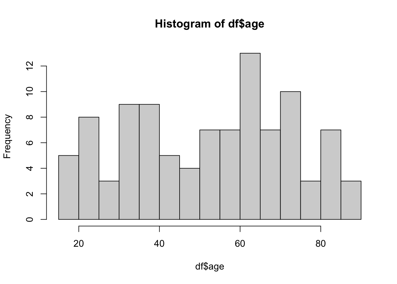
ggplot(df, aes(x = age)) +
  geom_histogram(
    binwidth = 5,
    fill = "steelblue",
    color = "black"
  ) +
  labs(
    title = "Age Distribution",
    x = "Age (Years)",
    y = "Frequency"
  ) +
  theme_minimal()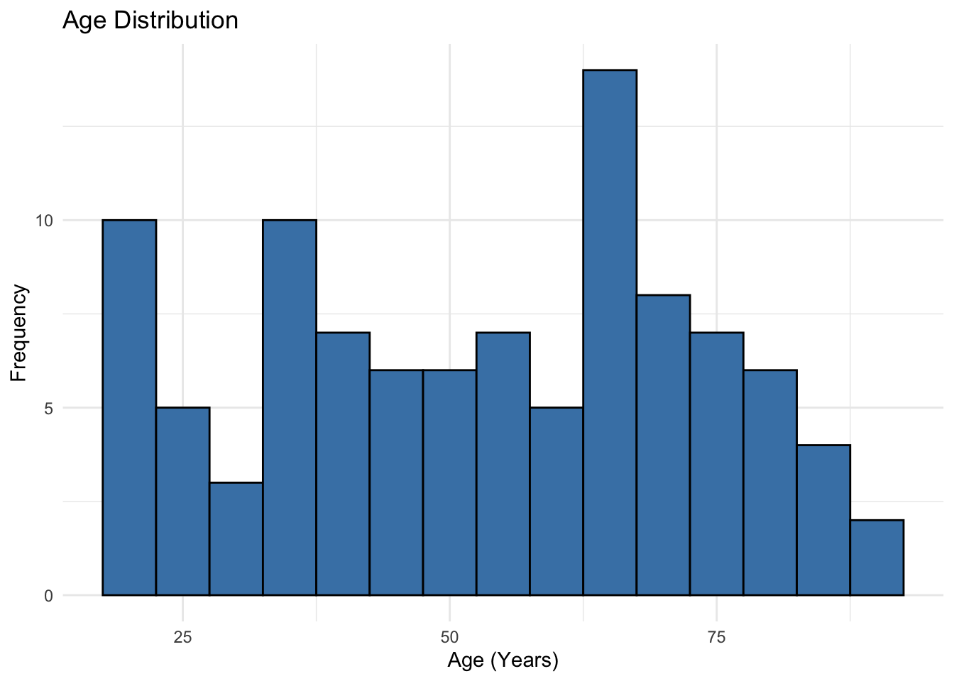
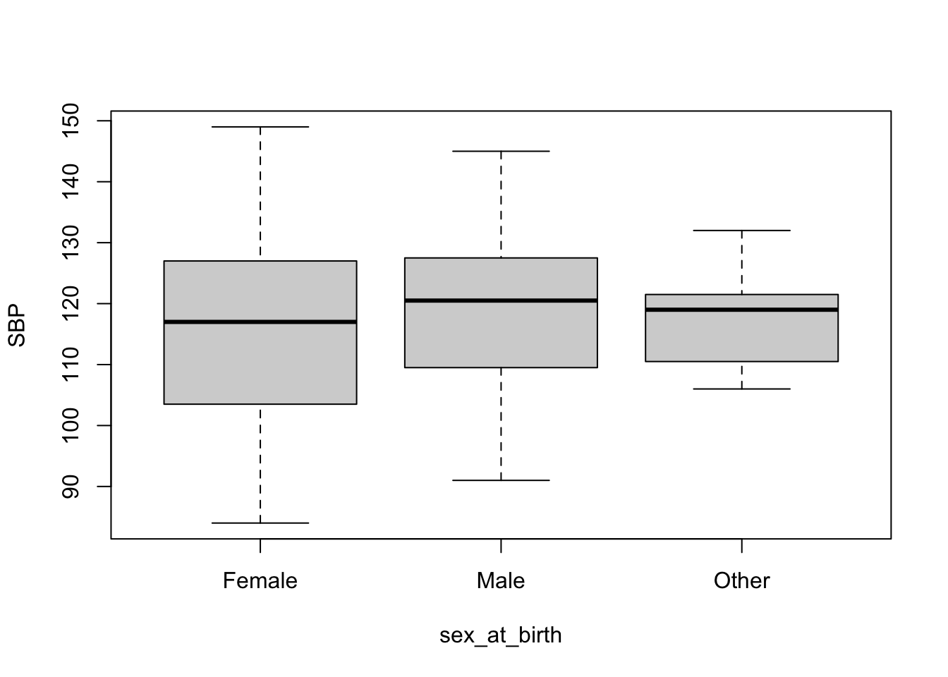
13 Box Plot
Box plots are good for visualizing continuous data broken down to some groups. Here, we will visualize distribution of SBP for each sex_at_birth category. Again, I will show both base R version and ggplot2 version.
# Base R box plot using the formula interface
boxplot(
  SBP ~ sex_at_birth,
  data = df
)
# ggplot2 box plot
ggplot(df, aes(x = sex_at_birth, y = SBP, fill = sex_at_birth)) +
  geom_boxplot(alpha = 0.7) +
  labs(
    title = "Systolic Blood Pressure by Sex",
    x = "Sex at Birth",
    y = "SBP (mmHg)"
  ) +
  theme_minimal() +
  theme(legend.position = "none") # Suppress redundant legend
Warning: Removed 5 rows containing non-finite outside the scale range
(`stat_boxplot()`).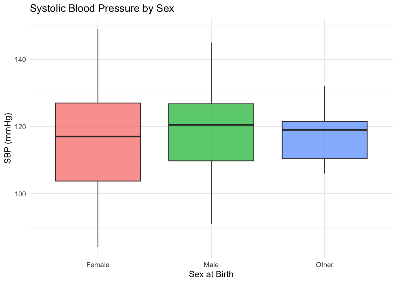
Warning
Take a note of the warning message in ggplot2 version that says 5 rows were removed. This often occurs when there are NAs in the data. We know SBP column had NA values. If this was unexpected, you need to inspect the data and handle the out-of-range values accordingly.
14 Scatter Plot
We use scatter plots for visualizing the relationship between two continuous variables. We will plot SBP against age.
# Base R scatter plot
plot(df$age, df$SBP)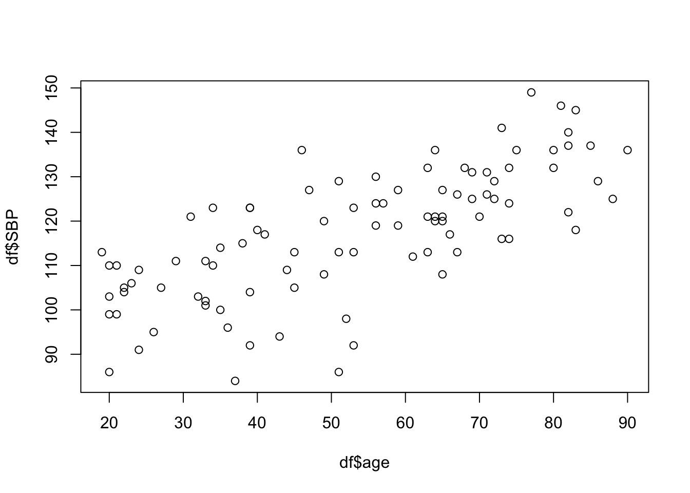
# ggplot2 scatter plot
ggplot(df, aes(x = age, y = SBP)) +
  geom_point(color = "darkblue", alpha = 0.5) +
  labs(
    title = "Systolic Blood Pressure vs. Age",
    x = "Age (Years)",
    y = "SBP (mmHg)"
  ) +
  theme_minimal()
Warning: Removed 5 rows containing missing values or values outside the scale range
(`geom_point()`).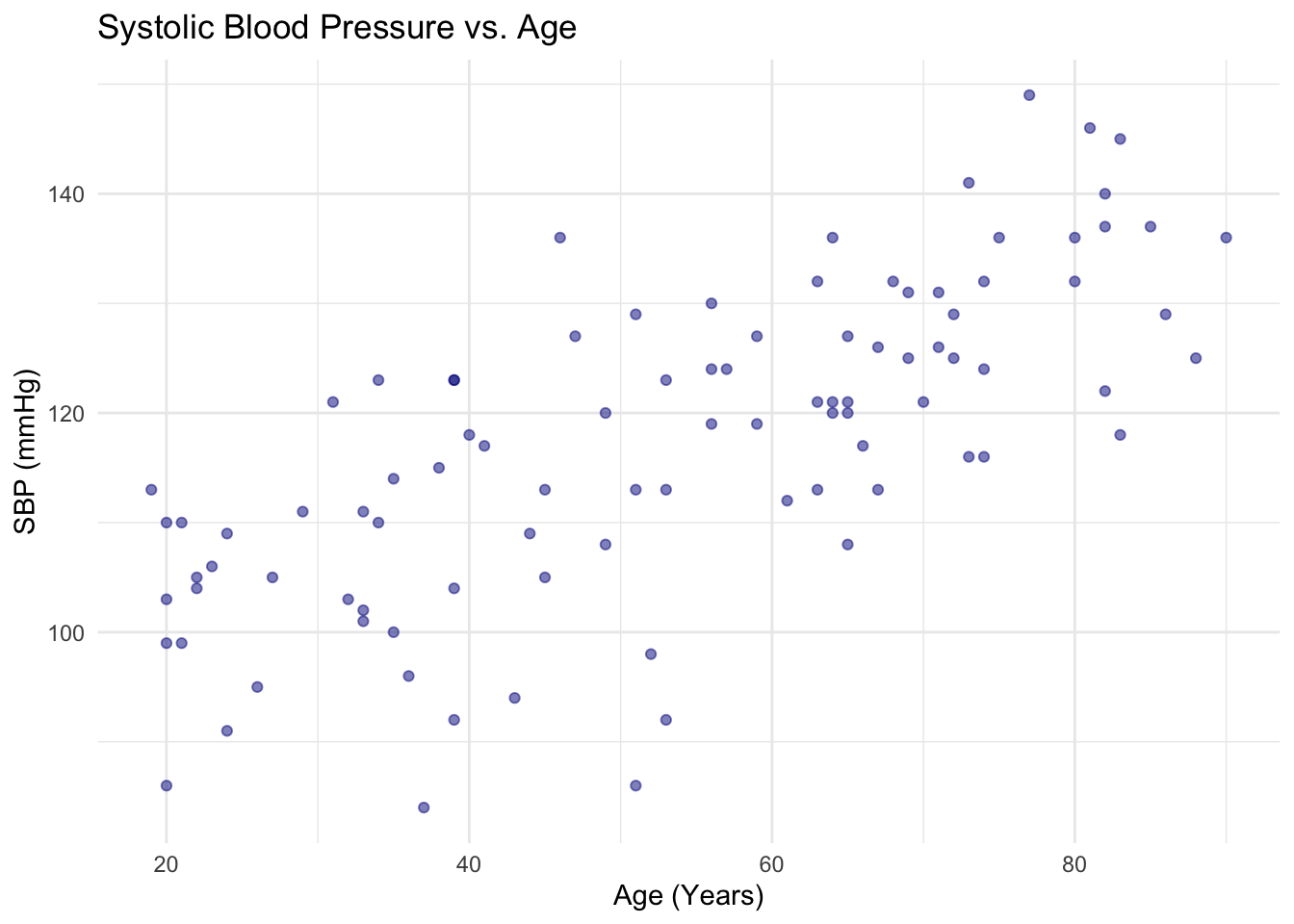
15 Preparing for Next Session
In session 4, we will learn how to perform basic statistical tests in R. Because this workshop is focused on learning the technical aspect of programming, discussions of statistical concepts will be minimal. Review the following methods as needed prior to the next session:
- t-test and ANOVA
- chi-square test
- linear regression
- logistic regression (WWAMI Research Methods course does not cover this. So we will go over this concept in a little more detail than others.)
We will also run queries, take a look at the extracted data, and interact with the Workspace bucket. You can follow along with your own data or just observe. However, do create your own Workspace and work with Data Explorer and bring any questions or comments to discuss in class.